Ōkami collective
ŌKAMI IS A CREATIVE COLLECTIVE THAT PUSHES BRANDS FORWARD THROUGH THE PRODUCTION OF INDIVIDUALIZED PHOTO, VIDEO, AND DESIGN EXPERIENCES. THE BRAND’S MAIN FOCUS IS TO CREATE VISUALS THAT RESONATE WITH THEIR CLIENT’S AUDIENCE, EVOKE EMOTION AND DRIVE ENGAGEMENT. THEY ARE A TEAM OF SKILLED CREATORS WITH THEIR COMBINED EXPERIENCE ALL WORKING TOWARDS THE SAME GOAL — TELLING A STORY.
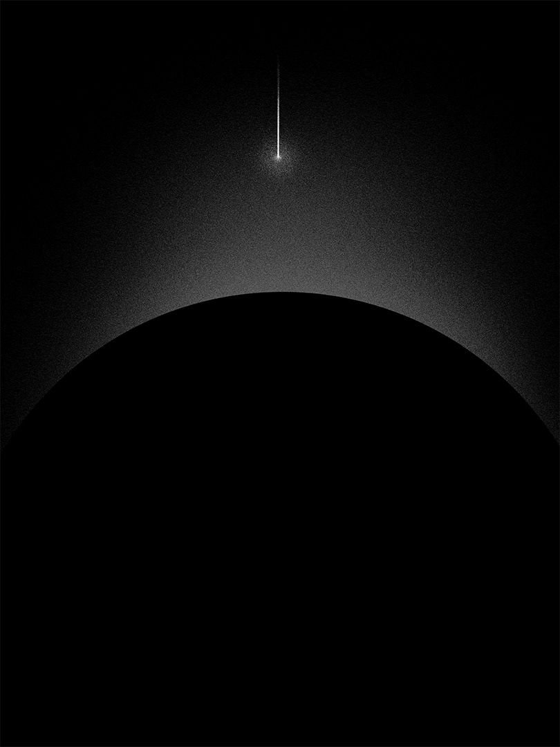
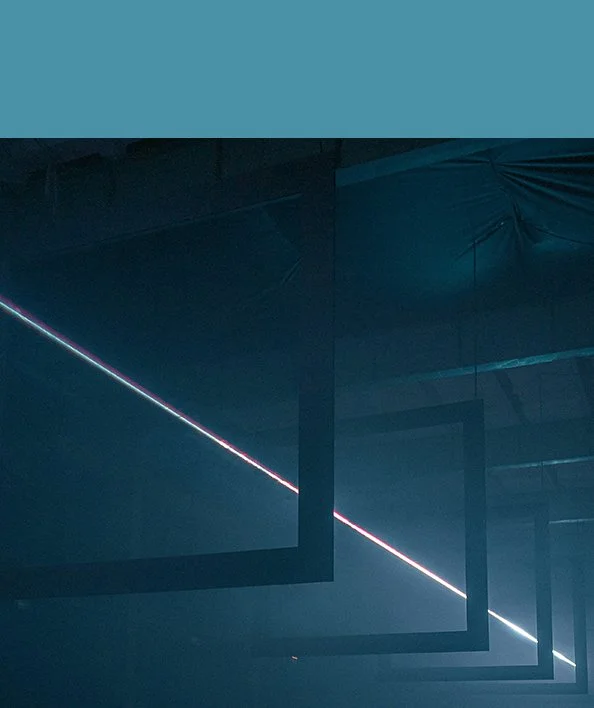
THE NATURE OF THE BRAND IS INFLUENCED DEEPLY BY CINEMA AND THE LIMITLESS WORLDS IT CAN CREATE. THE visual identity AIMS TO REFLECT THAT.
Storytelling + Logotype
It is important that the brand itself has its own story. With that in mind, the initial development process starts with keywords and research into the aesthetic of tech conglomerates from previous decades, shaping the brand's overall identity.
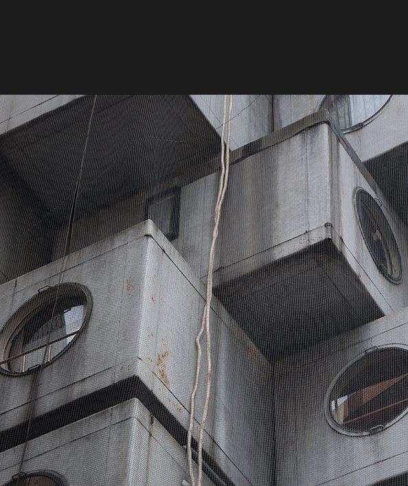
Drawing visual inspiration from eighties-era corporate logos, Bladerunner, Tokyo, brutalist architecture, and dystopian cityscapes, the Ōkami logotype commands attention. Its bold and modern letterforms honor a bygone era while acknowledging an impending dystopian future.
ART DIRECTION
VISUAL IDENTITY
TYPOGRAPHY
PRINT DESIGN
MOTION DESIGN
video // ŌKAMI collective
services
2023
credits
MOOD + typography + color
MOOD // These images form the initial moodboard, a collaboration between the client and myself to inspire the Ōkami identity. They encompass evident graphic influences, alongside photos, renderings, and keywords communicating the desired emotional resonance for the brand.


TYPOGRAPHY // The moodboard and logotype guide the selection of typefaces that complement the narrative: bold, sans-serif, and modern yet nostalgic.

Degular display
by oh no. type co.
headings

aktiv grotesk
by dalton maag
subheadings & body

video
by canada type
headings, captions

corporate logo ver2
adobe open source
japanese
COLOR // additional images are sourced to create the brand's color story. This step introduces a novel aspect to the design process, encapsulating the brand's 'mood'.

SHIBUYA
#FFFFFF

retrofit
#FBF6EF

paper lantern
#EF3B24

cables
#000000
nakagin
#1C1C1B
cybersky
#4A91A7

code
#8DC0D1

analog
#F7941F


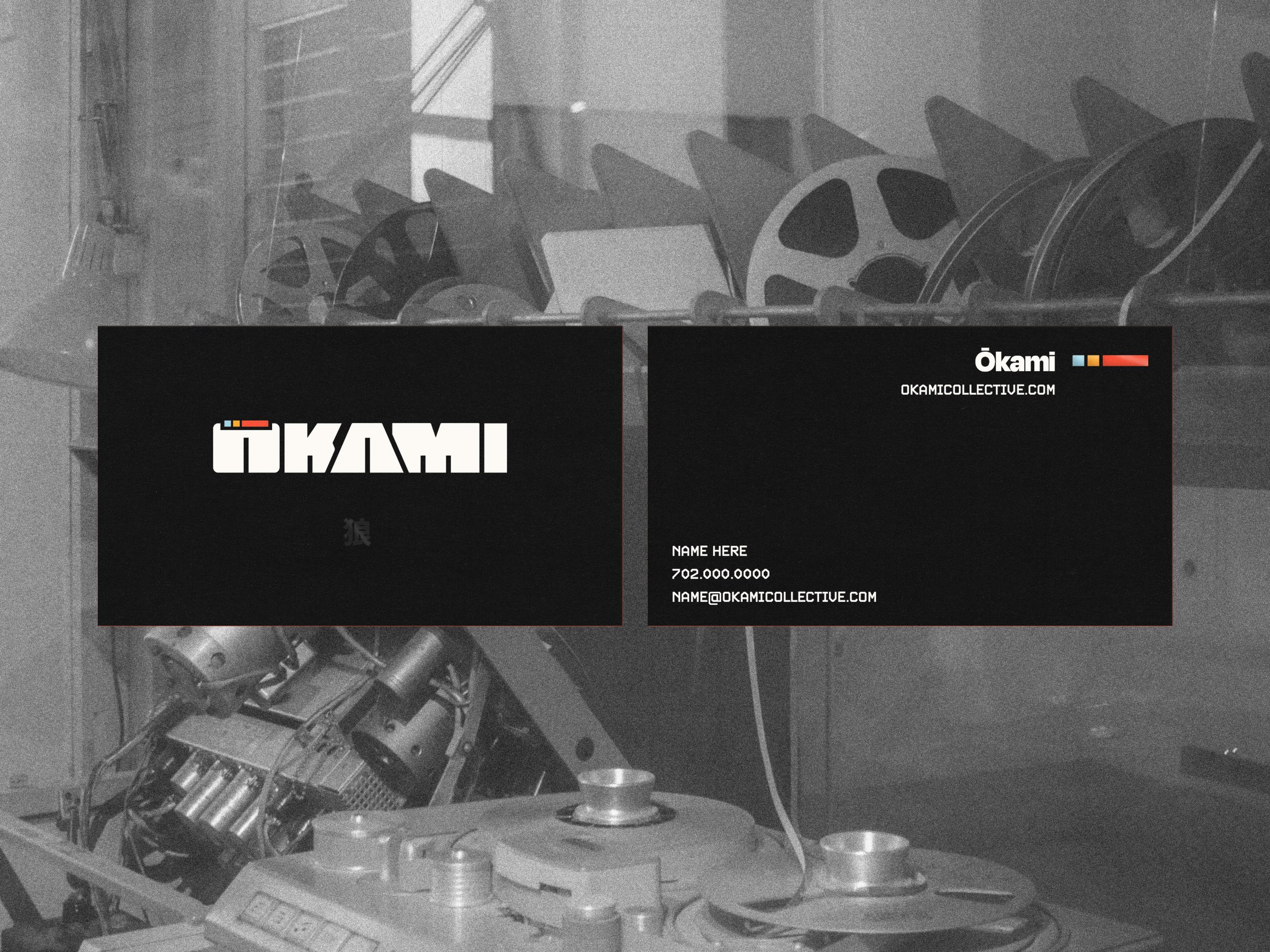
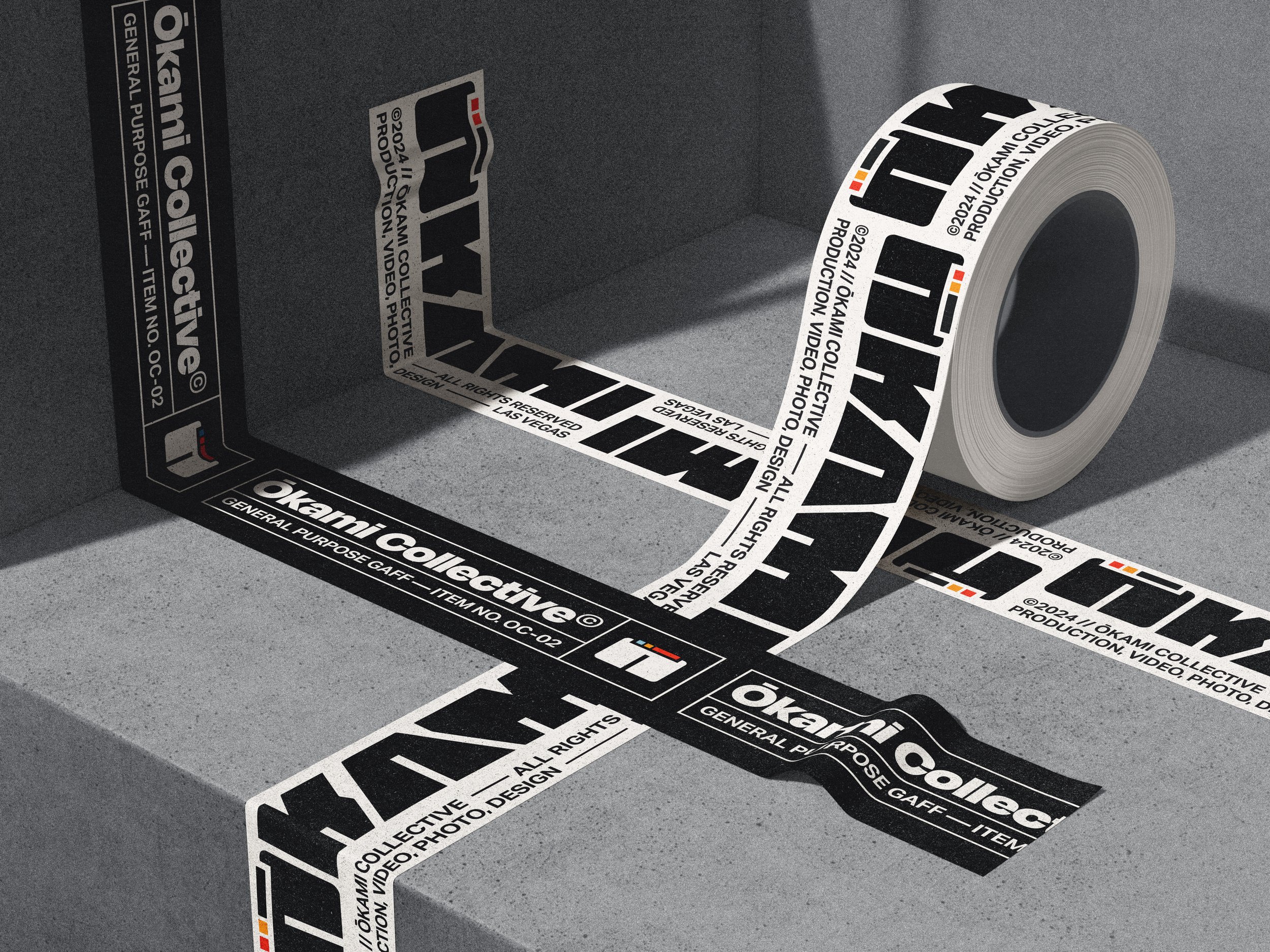
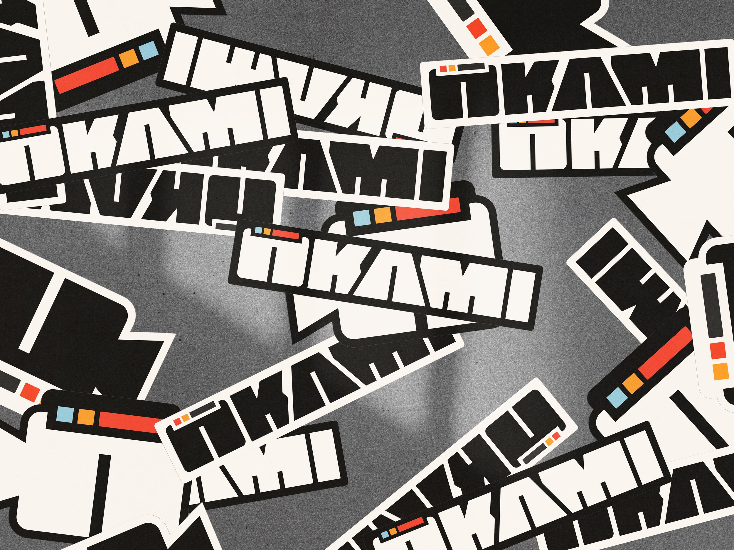
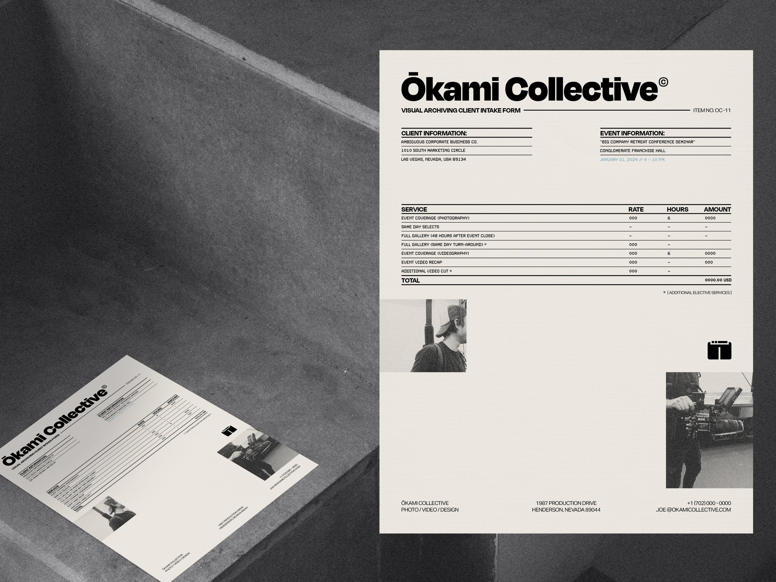
collateral + TONE
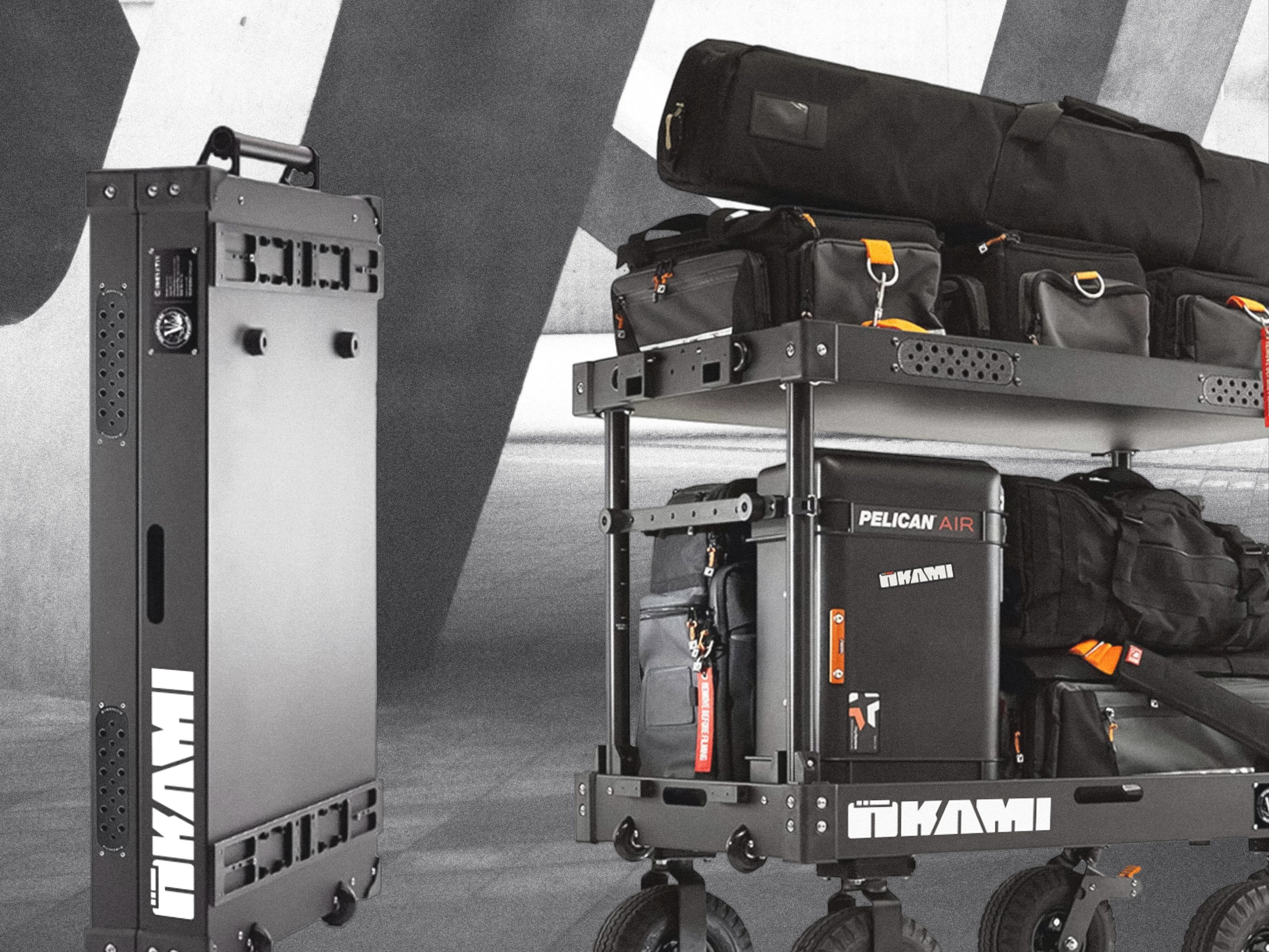
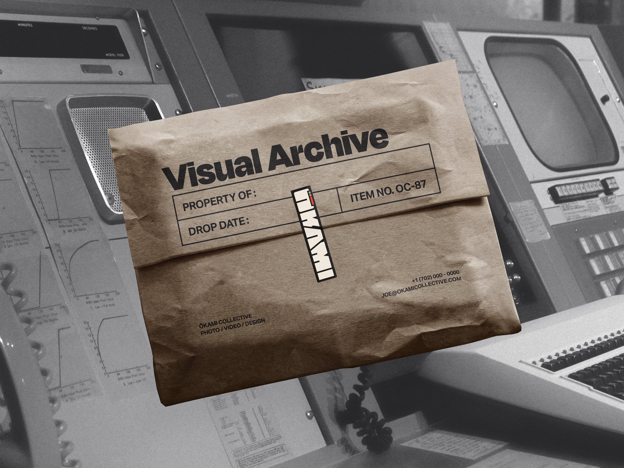
Each piece of collateral stands as an individual item, capable of holding its own graphically. While upholding consistency and continuity in branding is important, Ōkami prioritizes storytelling above all else, with no shortage of backstory.
Collateral items, such as gaff tape covering production wires, stickers on gear cases, and business cards handed to clients, aim to swiftly and effectively communicate the brand's essence. In brand copy and documentation, the aim is to mirror a tone reminiscent of a large corporate entity while preserving a nuanced demeanor.